I am sooooo late to the game on sharing todays post. However, I was determined to share some of the blush pinks I used in my fall decor this year. My motto is better late than never and hopefully it will inspire a s few of you. Typically when you think of the autumn color palette, you think of oranges, browns, etc. Right?
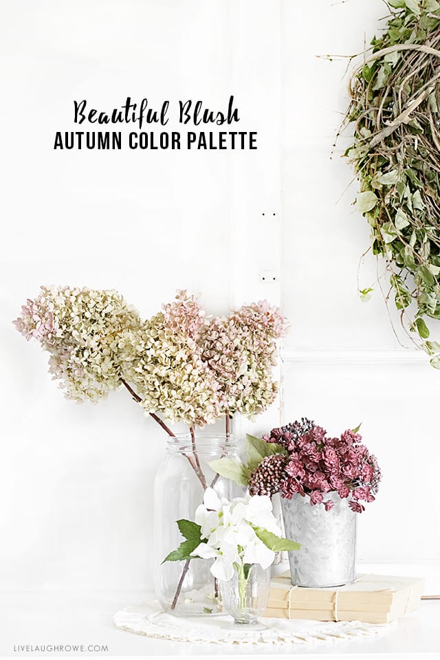 Autumn Color Palette in Blush Hues
Well, the color palette for fall is much bigger than you might think. The colors can go from bright oranges, yellows, browns, etc to mutes hues such as blush hues, blues and greens! This year, a very different color scheme seemed to enter the fall decor arena — blush colors!
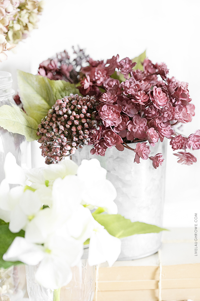
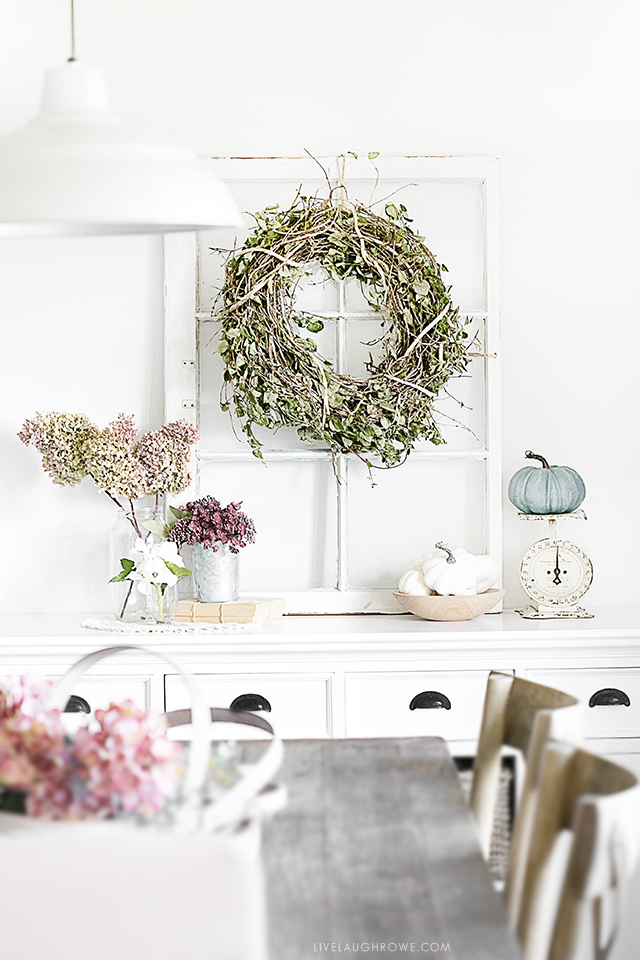
It’s important to note that decor doesn’t have to be expensive or elaborate. It can be very simple, yet beautiful. I think my buffet this year is a true example of that.
 Beautiful Blush Fall Decor

Starting with the dried hydrangeas, I simply added to that with a few additional stems that I purchased (and already owned), white pumpkins, a beautiful blue pumpkin, vases and vintage pieces. As a result of this simplicity, the buffet has become a favorite of mine this season with the muted colors.
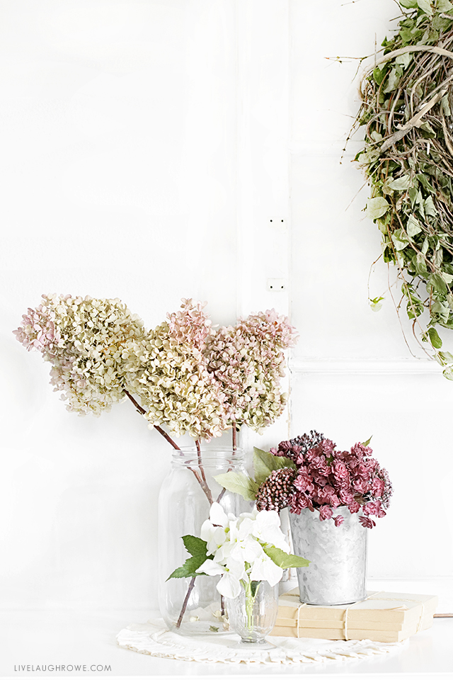
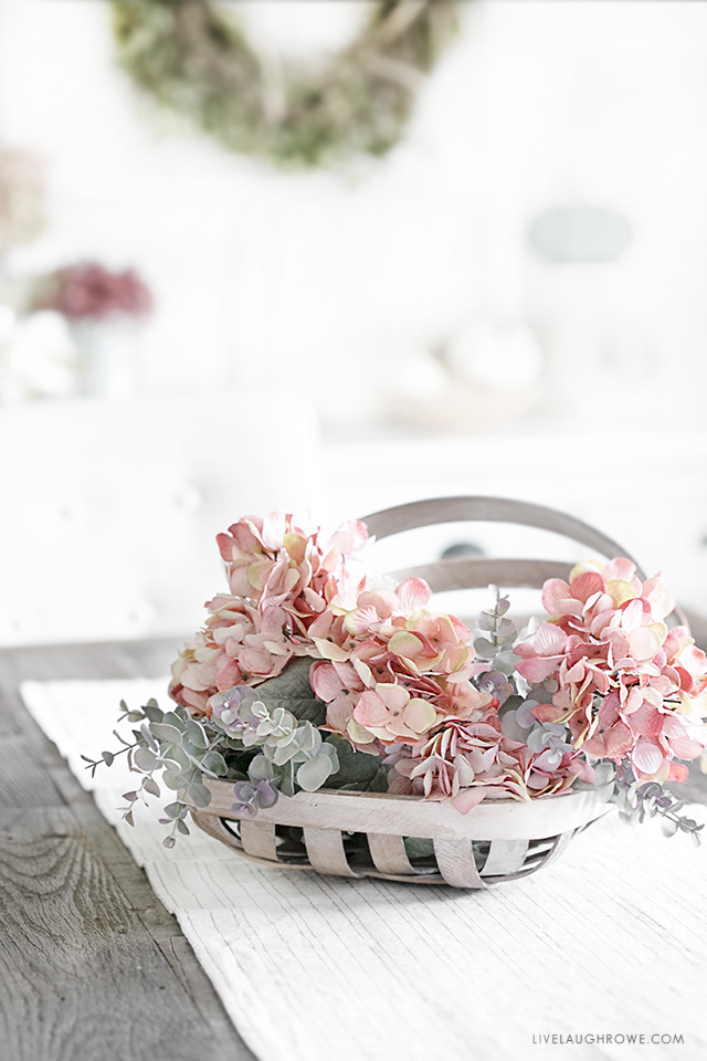
We currently have a rustic bench behind our sofa, which seems to visually separate the two rooms well. And the pictured pillow covers (from Ikea) were a perfect splash of the muted pastels I was currently using.
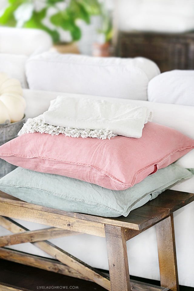
It’s easy to get into the rut of stereo-typical color schemes — this year I stepped outside the box. Will I do it every year? Meh. Time will tell. Hope you’re inspired!

Facebook | Instagram | Pinterest | Twitter | Google+
 Beautiful Blush Fall Decor




Leave a Reply